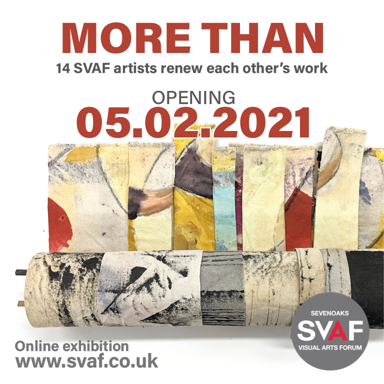
Welcome to ‘More Than’.
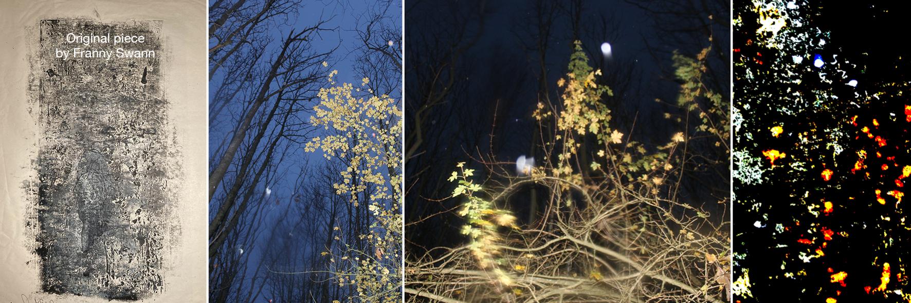
The work in this on-line exhibition has been completed since October 2020. It’s unusual premise was to make a new work from an unfinished piece donated by another artist. The idea was proposed by Franny Swann who made this work from a print of circles passed to her by Christina France.
SVAF then took up the idea to make into an exhibition and 14 artists have swapped work and applied the simple rule to take whatever was relevant to you from the donated work to make it your own. Such an experimental approach required them to address intriguing problems and questions including the level of respect due to the original, ownership, right to destroy and responsibility for disappointment. The artists have shared their thoughts alongside images of the starting points and outcomes.
SVAF artists:
Louisa Crispin, Franny Swann, Eleanor Swan, Sally Eldars, Sue Evans, Sarah Cliff, Juliet Simpson, Maria Turner, Jenny Dalton, Rosalind Barker, Ann Bridges, Caroline Gould, Cherie Lubbock and Amanda Hopkins
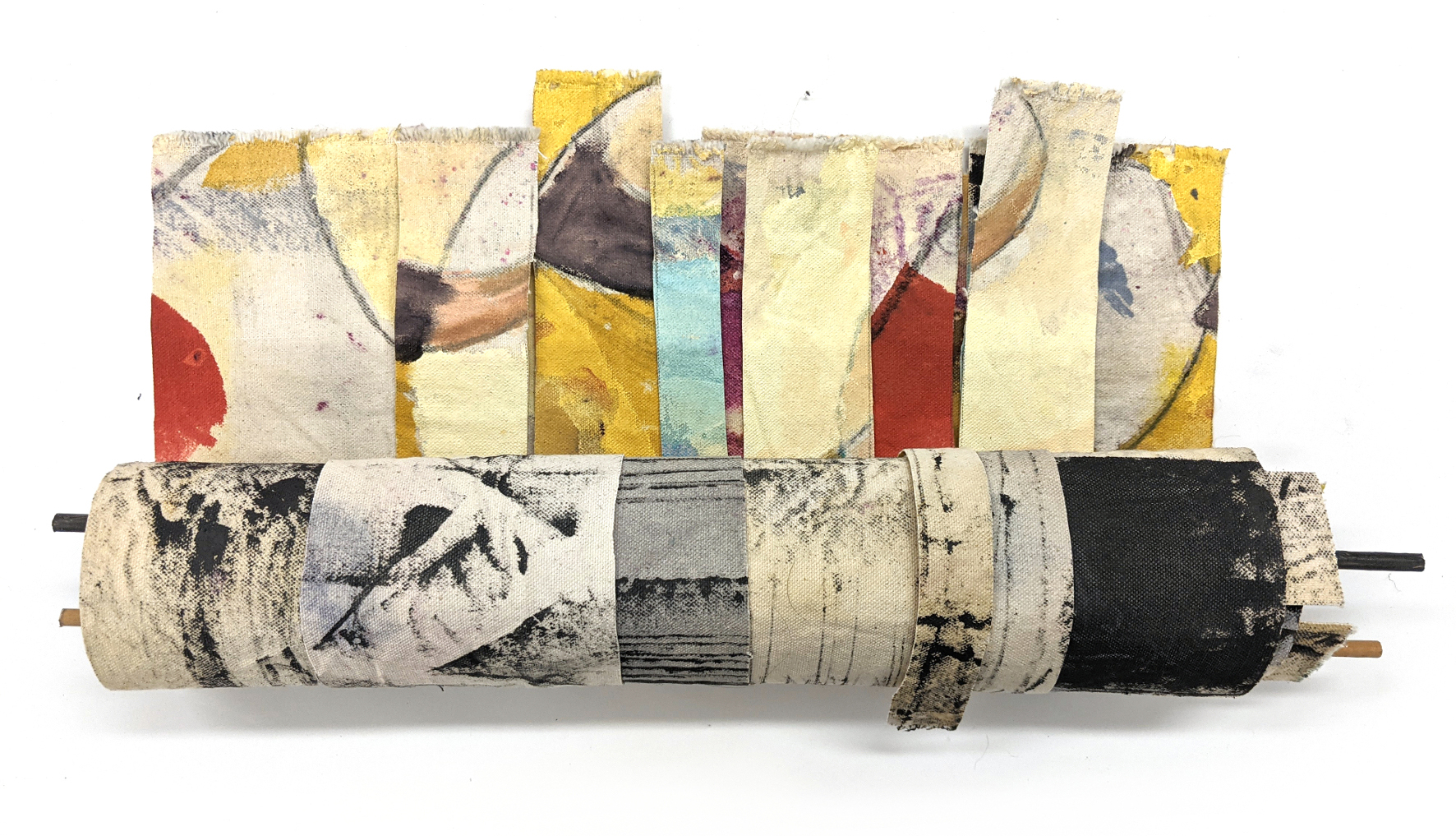
Louisa Crispin
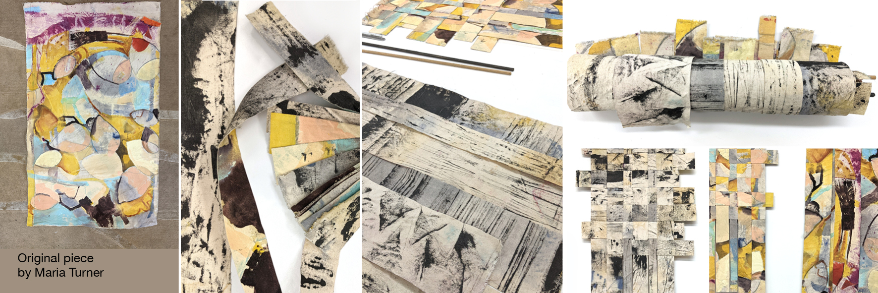
Title: Comfort, 46 x 12+ cm
I expected to be out of my comfort zone with this project but 2020 has left me keen to try new things. Canvas and colour are both definitely new.
I was drawn to the reverse of the canvas but wanting to see how the colour would complement my use of graphite. My original intention was to create a spiral book, however this hid much of the interesting marks and colours.
Leaving the strips in the studio to mull over I began to feel a need to weave, creating 2 different hanging pieces from endless possible combinations.
Rolling up the pieces to keep them safe was a final light bulb moment.
I doubt I will work with canvas again!
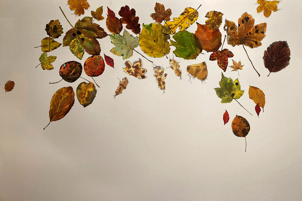
Franny Swann
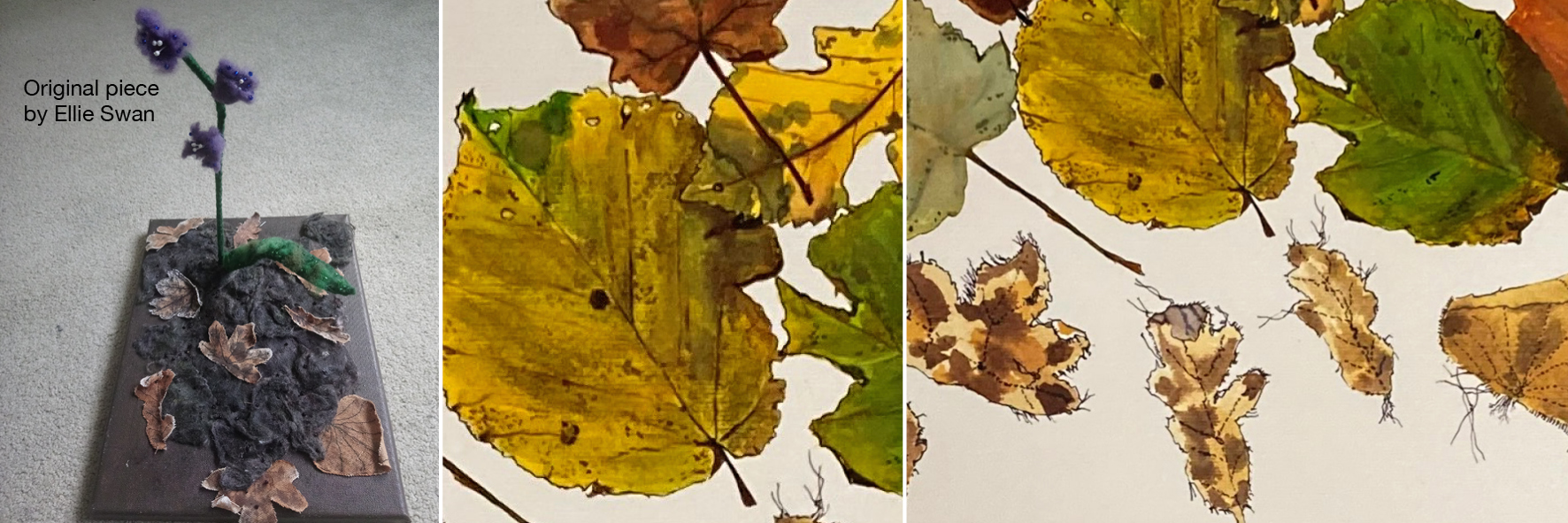
Title: Another Fall, Another Page
As I made this work the autumn leaves were falling fast, skeletal trees were emerging and we were entering both an uncertain pandemic winter and an uncertain political and economic future.
Ellie Swan is a textile artist who works with natural materials and dyes, and my use of the natural world honours this in the collaboration.
Ellie’s textile leaves live on, now painted and hidden within the work, and with them questions about the visible and the hidden realities of the human cost of 2020.
Sue Evans
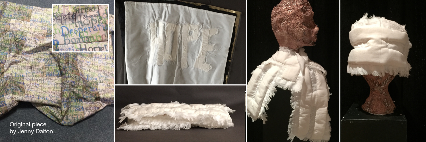
Title: Hope
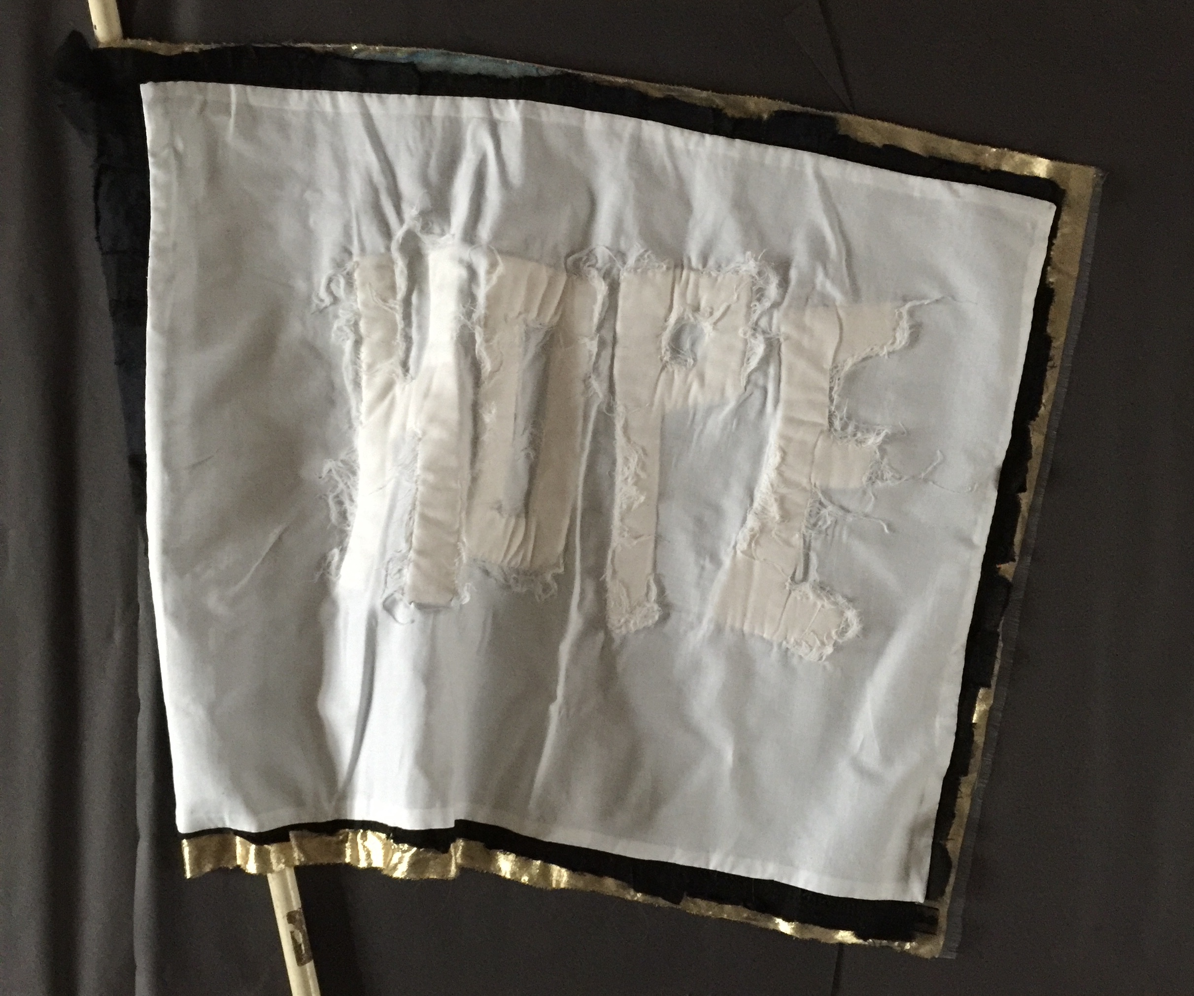
I received a small quilt made of three layers of fabric: patchwork top layer, batting and cotton lining. The patchwork was printed with words conveying helplessness. I felt it was fully resolved so knew it had to be drastically altered to make it my own. To respect the spirit of the original I focussed on a single word: ‘hope’, which seemed apposite in our current situation. Among many definitions hope has been characterised as a weapon, a Christian virtue, tool of self-deception, the best of things, but my starting point was the comfort embodied in the quilt. I have ended up with two pieces that see hope as a soft crutch, used as protection from reality when all else has failed.
The batting and lining were used to make two pieces. Firstly, four letters which can be folded or wrapped to make a warming scarf, kneeler, blindfold or whatever garment or object that can assist the hopeful… The second is a white flag with a spot of military bling.
I was happy to remake the work but am left with the question about whether to present this as my work in any other circumstances.
Sarah Cliff
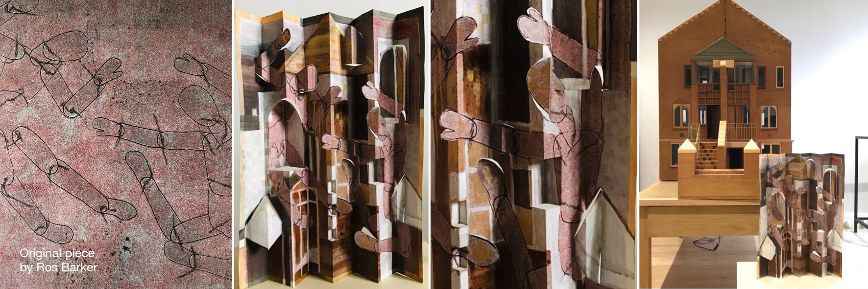
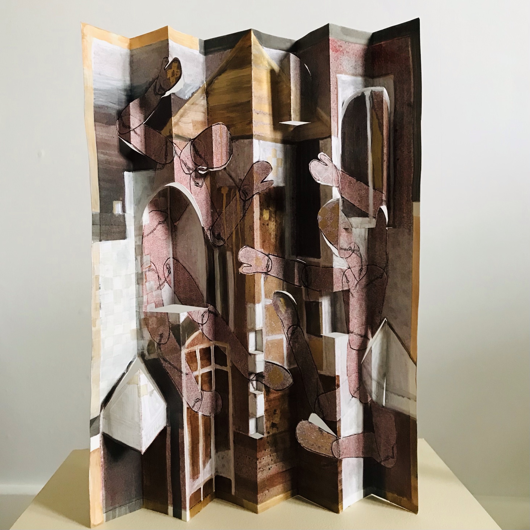
Title: The Model House Poltergeists, 29 x 41 cm
Prior to lockdown I was entrusted with the guardianship of a detailed scale model of a post-modern, award-winning house designed by Sir Jeremy Dixon and built in 1979 in Notting Hill. The design juxtaposes modern structural grids on a human scale with traditional aedicules and architectural flourishes to surreal effect.
I was sent a hazy, textured, pink monoprint, featuring puppet figures. I decided to transform it into a cut and folded abstract drawing of the model house. The puppet figures slip through windows and reach out from the walls. In my imagination they are poltergeists, disrupting the architectural lines and symmetry.
I found this project absorbing and dangerous. Altering an existing piece of work, while preserving something of the original, was a challenging goal. Committing to cutting and folding meant that very quickly there was no turning back. The biggest challenge for me was selecting a palette that complemented the original pink.
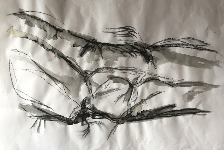
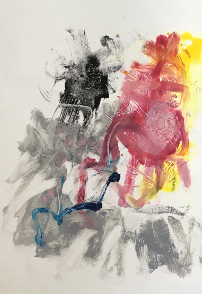
Juliet Simpson
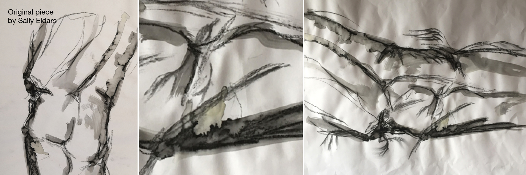
Title: A Battle in the Sky
Love the vibrant lines in the original piece.
Materials used: charcoal from the fire, a thin staedtler pen, hair spray.
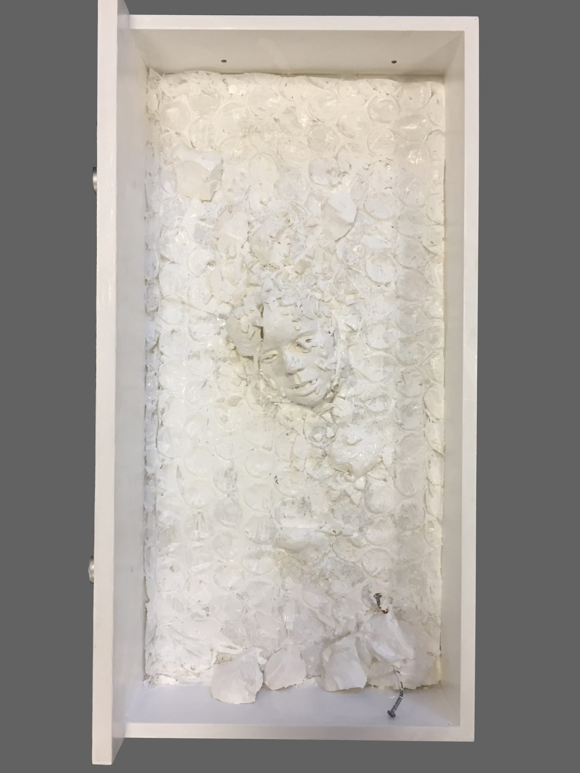
Sally Eldars
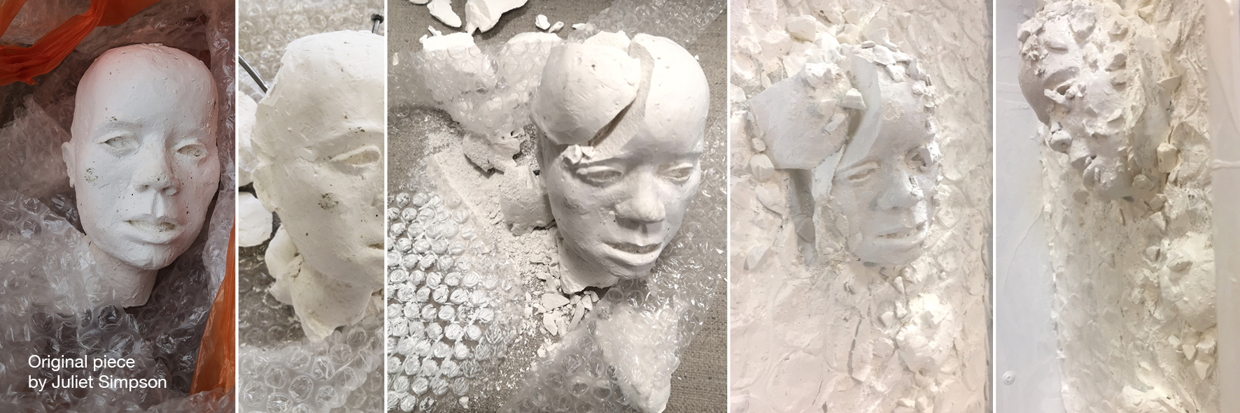
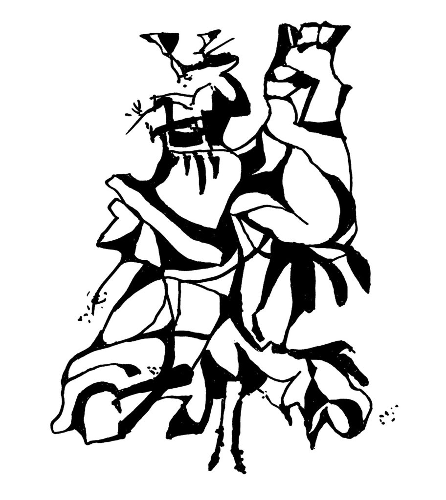
Title: Sinking, 35 x 40 x 15 cm
I was given a plaster bust donated by Juliet Simpson. Simpson works with different materials and is known for exploring her surrounding woods and finding old oak to work with. She is also concerned with climate change and the environment.
When I received this piece, my instinct was to smash it. During 2020, the Covid-19 pandemic and prolonged lockdown restrictions started to have an impact on our mental health and the economy. My urge to smash this bust was my way of letting out my frustrations at the on-going situation. I still had to be careful in my destruction, as I wanted Juliet and the essence her work to come through in the final piece.
By coincidence, during the same time, I was walking my dogs in the woods and I happened to come across a desk that had been dumped. On close inspection, it contained a drawer that had not succumbed to the elements. So, I took the drawer. The found drawer, made from MDF, would become a frame/vessel taken from the woods, but not of the woods.
Simpson’s bust transformed into my own work – a comment on the environmental crises. Mother nature is fragile: crushing, gasping and sinking. Head just above water – sadly, without too much hope. The ‘frame’ seems to make escape impossible. The whiteness is stark, and the plastic bubble wrap, used initially to protect and shield the bust in transport, is also contributing to the demise of our natural habitat.
Reflecting on this process, I can’t help but think about the ownership of the piece. Although we agreed as a group that the final piece is attributed to the artist that made it; I felt that, in my case this piece is more of a collaboration, as the bust can still be recognised. Maybe, I should have destroyed it further to remove any link with the original artist? I also wonder, what were Juliet’s original intentions for this bust?
Looking at the final piece, a feeling of desperation overcomes me, as we are living in fragmented times. It would take a huge effort, on an international scale, to reverse the damage we have done to our environment; and to collaborate, putting aside political and financial interests
The process of this project and the shattered bust reminds me of Cornelia Parker’s work, where she destroyed things in order to reassemble them. Her process, as well as the materials, are just as important as the final piece. The potential of the disused item was transmuted and realised by what each of the 14 artists created, into something newly meaningful.
.
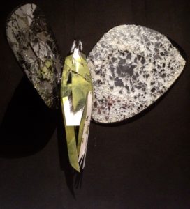
Amanda Hopkins
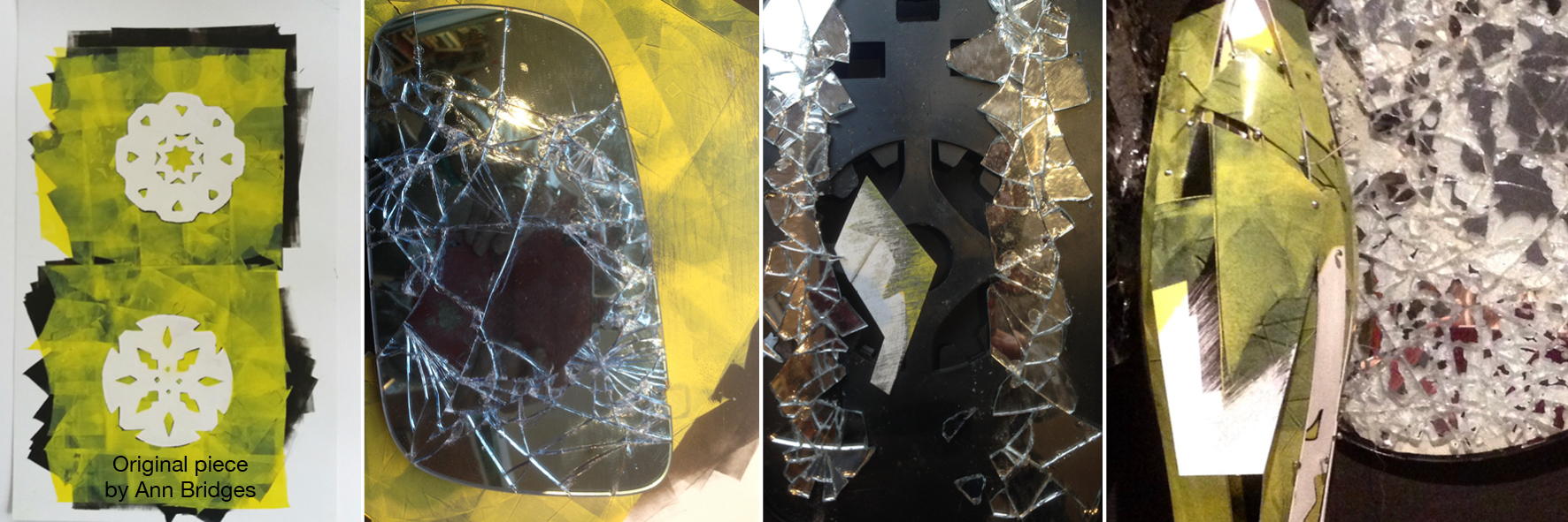
Title: Insectum
Several ideas occurred to me but in each case I tried to anticipate the outcome – daft because that’s never possible. I did not want to interfere with the work irreversibly.
Eventually, deadline looming, I dived in and began cutting, sanding, fragmenting Ann’s image. Taking the pressure off, I gave up thoughts of creating ‘good’ work. My magpie instinct hunted and explored unusual material juxtapositions, 3D possibilities. The decision was to have some fun.
The outcome is unexpected and has lateral links to other work. Thankfully, this project has forced me to let go, deconstruct some of my own past work as well as Ann’s – with very useful results. So thank you Sue and Franny, Ann and Sally for making this project possible.
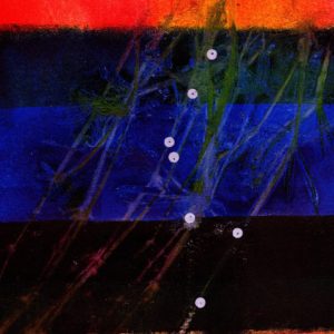
Ann Bridges
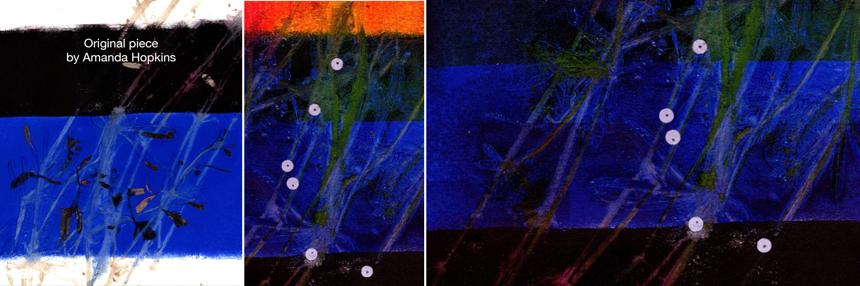
Title: Bobby Buttons
Amanda’s artwork was called Stickyweed, an original print which used the wild plant Galium aparine in the printing process. It’s commonly known as cleavers, stickyweed, goose-grass, catchweed, claggy meggies, sticky willy and by many more names that allude to its ability to attach itself to whatever’s nearby.
My initial thoughts were to gather some of it and work with it to develop a ‘More than’ idea and image, but being winter there was just new growth in the hedgerows, not currently showing off its sprawling and clinging habit.
The print is on heavyweight absorbent paper. I usually make printed artwork on smooth coated shiny card. I speculated that if I put more colour on top it would probably look quite different to what I might expect, but wanted to give it a go. I picked off the dried remains of the plant material and with a hand roller applied yellow ink to the print. I wasn’t sure about the result, wondering if I’d made the wrong decision. When it was dry I rolled Magenta ink over the print which lifted and also deepened the colours, which then felt like progress.
The composition of the Stickyweed print suggested a pond or canal with dark deep water and I began to explore this idea (turning it upside down). It needed some touches of light so I laid some pale lilac ‘holes’ from a paper punch on it. With the addition of a tiny pencilled dot I changed the circles into shapes that have a hint of the round seeds, or perhaps they just might be toad spawn.
I’ve given it the title Bobby Buttons (another name for this pretty plant).
Eleanor Swan
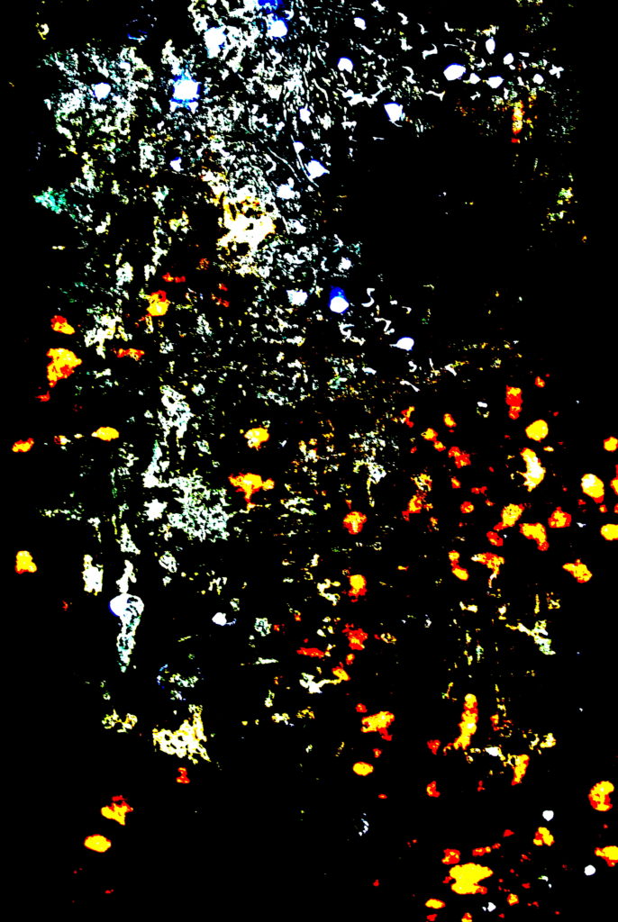
Title: Will O’ the Wisp
The foundation of my creative process for this collaboration is the theme of loneliness, as expressed in ‘Ghost Print’ by Franny Swann. I chose to explore this concept in a literal sense, venturing out into the woodland alone on a dark, tempestuous winter’s night and capturing my experience using photography. In creating this disconnection with humanity, I felt an overwhelming sense of the presence of an abstract realm of existence beyond our earthly reality. Delving into folklore I came across the Will O’ the Wisp which I feel embodies the essence of my creative journey:
Will O’ the Wisp:
Leave Civilisation
Far Behind
And Wander
Into the Woodland
On a Dark
Winter’s Night.
Listen
To the Whisper
Of the Unseen.
And Open
Your Eyes
To the Elusive.
The Otherworld
May Reveal.
Curious Lights;
Capricious and
Enticing.
Mesmerising.
The Will
O’ the Wisp.
The final artwork is a photograph of the original monoprint, worked over with ink and bleach and cut into. Through exploring creative approaches to layering light behind this fragile piece, I have evoked the enchanting presence of the Will O’ the Wisp.
Caroline Gould
Title: Knight-errantry
Discordant elements come together in their controversial search for truth.
In Chérie Lubbock’s original work, I see two riders on horseback galloping towards us through a dusty pink landscape. This brought to mind the landscape if La Mancha and Don Quixote with loyal companion Sancho Panza on their search for adventure.
Quixote had long studied chivalry, convinced that this discipline has the power to make the world a better place.
Quixote’s dramatic visions, for example seeing windmills as enemy giants, meant his idealism was regarded as insanity by his contemporaries. But his story, published in 1605 still demonstrates the transformational power of visionary ideas.
My response conveys a sense of Quixote’s world as it collides with the everyday reality as experienced by Panza as he navigates both worlds to ensure his visionary master’s survival.
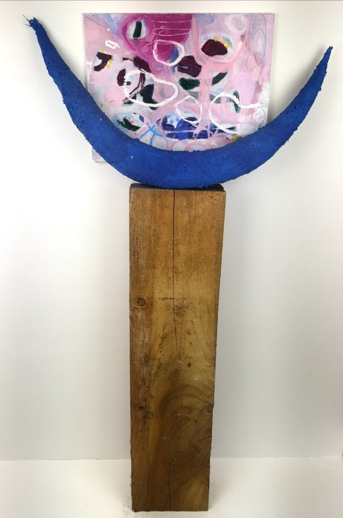
Chérie Lubbock
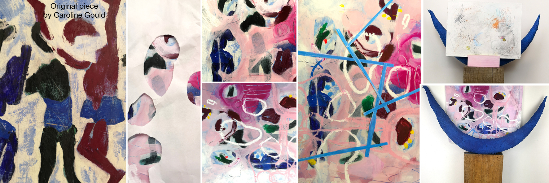
Title: They Think It’s All Over, Wood, jesmonite, plaster, acrylic paint, 114cm x 58cm x 11cm
It was with excitement and trepidation that I received the artwork from Caroline Gould. Would I have any ideas? How would I go about it? What did I want from this activity?
At first, I was completely at a loss as to how to proceed.
I began to paint over the work and then rubbed back to reveal parts of the painting. I had not expected to feel so emotional about the whole experience and was unable to sleep that first night and decided to turn the work into a sculpture.
Using the same blue that had been in the original work, I began to feel that I was honouring the artist’s intention without compromising my own ideas. I created a simple sculpture using a blue moon shape, which often appears in my work, and also linked to Caroline’s piece.
As a result, I realised that in fact I was more confident in my own style than I had thought.
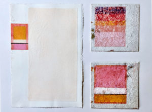
Maria Turner
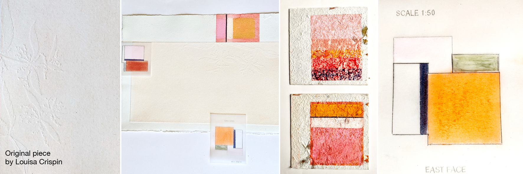
Title: Pages One to Three
I was given a beautifully embossed piece of white paper by Louisa Crispin.
The nature of the piece given, ie, pristine, tactile and quiet meant I responded with these key elements in mind. What became important in working with the piece were:
– the intervention of the embossed plant at the edge
– the soft voice of the piece
– the offset embossed rectangle
– the rough edges
These elements were focused upon in the range of experiments/pieces developed.
Surface was important, so trial and error with textured surfaces was tried. I chose a tactile medium to work with which responded to the surface in varying ways – I chose pastel for its sensory qualities.
The first intervention I made was to cover the raised section with a dusting of pastel – I felt throughout that I could not move further than this on this raised platform – it has a completeness that meant I became more focused on its edges or on temporary interventions I could make.
I wanted to intervene with something from my practice, using the language of colour and abstract expressionism, basing one of the pieces (where the plant intervenes off the edge) on Mark Rothko’s White Centre (Yellow, Pink and Lavender on Rose). The final piece also includes two further pastel paintings on handmade paper book covers, which contain fragments of plant material.
Rosalind Barker
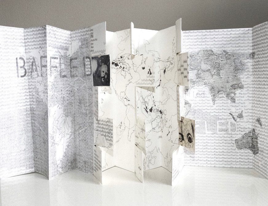
Title: Baffled
For the last couple of months, I have been drawing maps reflecting my mixed thoughts about our current lives in the UK and the World, baffled seems to sum it up!
Raising cartography by the repeated drawing of one word was slow, repetitive, meditative and calming. The first UK baffled drawings working in HB pencil on Sklzzen No 1 A2 paper felt harsh, tight and constrained, possibly echoing our situation. While the World drawings were much softer and dreamy in 5H. All sorts of thoughts about scale, the nature of text, supports, media were generated but ‘baffled’ felt right.
![]() —=
—=
Contemplating Sarah Cliff’s original work in the studio 2020
Into these musings came a collaboration piece from Sarah and baffled summed up my attempts to work out how it was achieved. How to replicate or alter it, plus what the work and images signified.
The piece made me think of M.C. Escher, mathematical drawings of staircases moving through non-existent dimensions. Escher’s confused depth, perspective, angles, all achieving the impossible circuits on a flat plane. So, the starting point was working onto the original cut cartridge paper, using ‘baffled’, world mapping, rotation and graded pencils.
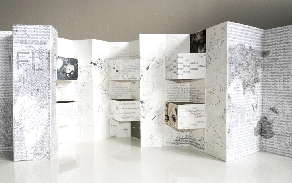
While the drawing is ‘more than’ its conception, even its potential presentation is variable. It remains unresolved and experimental, a building block within a journey. A reverse of Escher’s ‘We adore chaos because we love to produce order’ but adding to my musings.
Baffled: Totally bewilder or perplex; to confuse someone completely; to be too difficult or strange for someone to understand or explainPuzzle
Bewilder
Perplex
Mystify
Bemuse
Confuse
Unclear
Enigmatic
Obscure
Unfathomable
Inexplicable
Incomprehensible
Impenetrable
Cryptic
Befuddle
Confound
Flummox
Stump
Nonplus
Bamboozle
Jenny Dalton
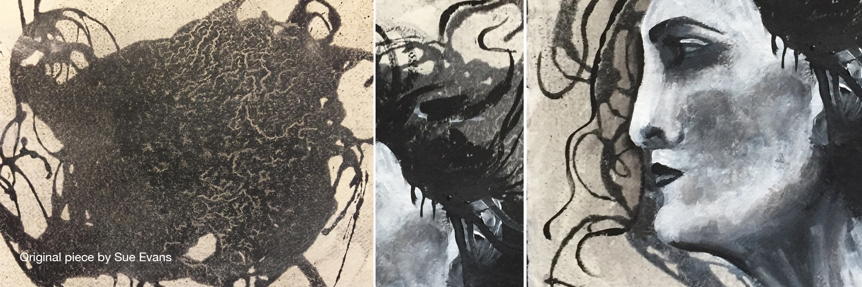
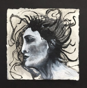
Title: Medusa
I looked at this for a long time before I was able to work on it. My intention was to cut it up and reconstruct it into a landscape and to write into the spaces words or phrases which represented peoples feelings about the pandemic. I made several photocopies on which to try out this idea but I was not inspired at all. The more I looked at it the more I could see a face. I did not want to completely obliterate the original interesting shapes, so the original has evolved into ‘Medusa’.